Overview
The visual development workbench is a tool in IoT app development.No need to write code, just drag components onto the canvas in the editor, and then configure the component's display style, data source, and interactive actions, to develop web applications in a visual way.Suitable for device status monitoring panels, board page dashboard, device data analysis reports, etc.
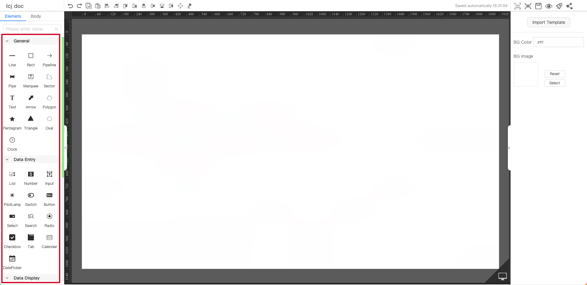
Visual development workbench, divided by function:menu bar, component library, property panel, canvas.
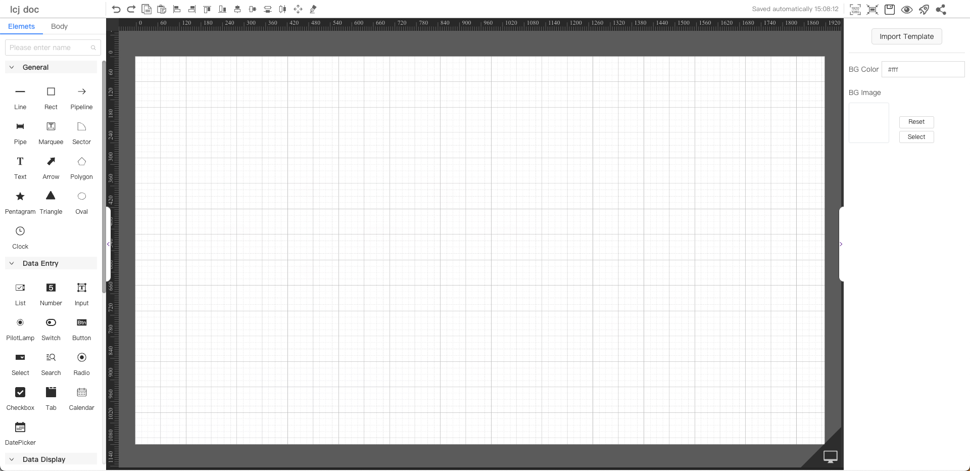
Canvas
The canvas is the drawing area. Drag components to the canvas for editing and drawing on the dashboard.
Menu Bar
Left:Board name Center:Undo| Redo| Copy| Paste| Align left| Align right| Align top| Align bottom| Vertical center| Horizontal center| Horizontal split| Vertical split| Full screen| Pipeline| Right:Resolution setting| Screen adaptation| Save| Preview| Publish| Share| Version number
Component Library
The component library resources provided by the system include general components, data entry components, data display components, media components, and layout components. Please refer to detailed components.
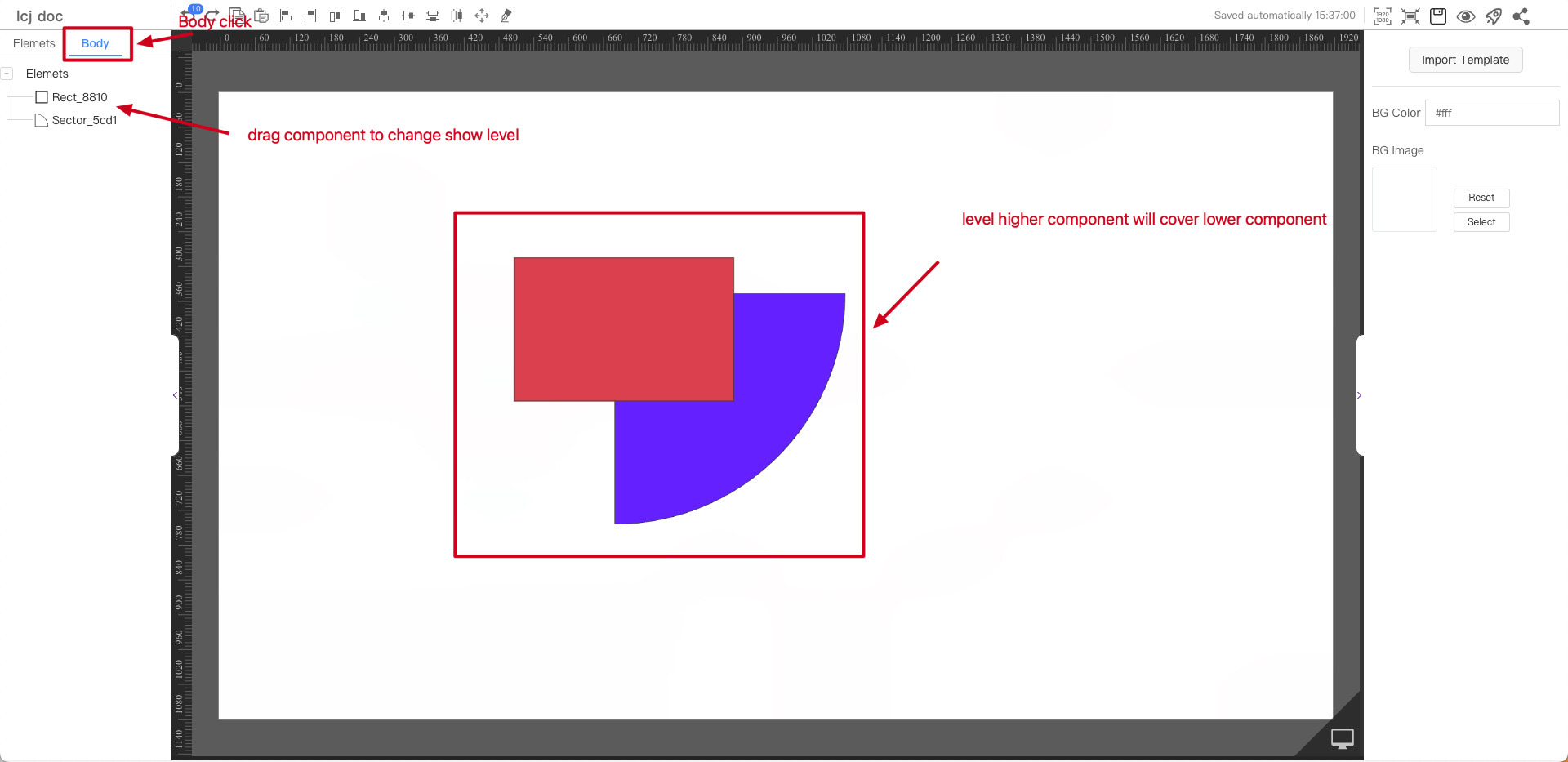
Body
Mainly solves the problem of component coverage. The display priority of components is from top to bottom (dragging components can change the priority). You can also quickly locate the position of components
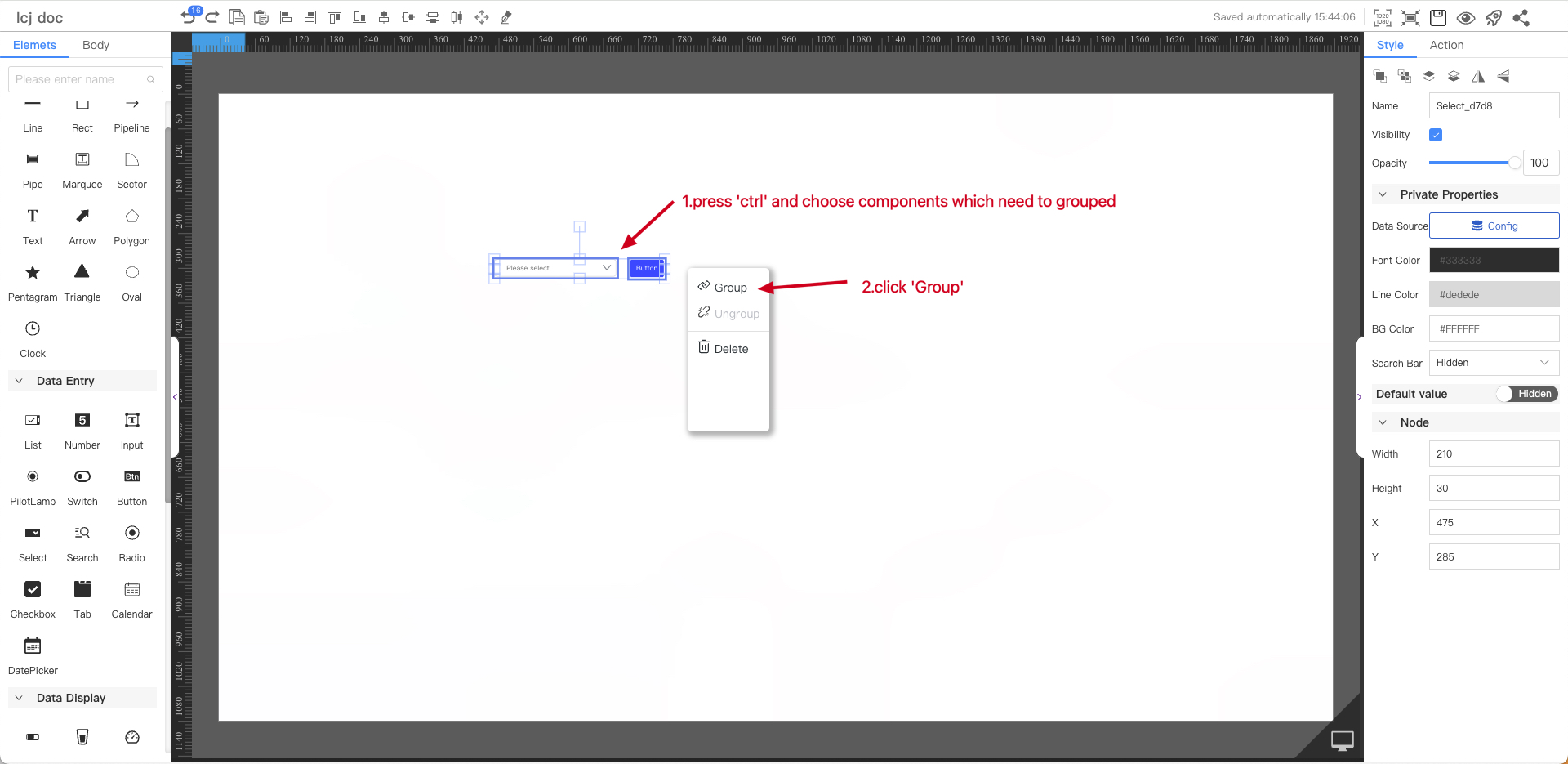
Component Operation
Group Components
You can group the components that have been made to avoid accidental touches or changes.
The following group the select and the button together
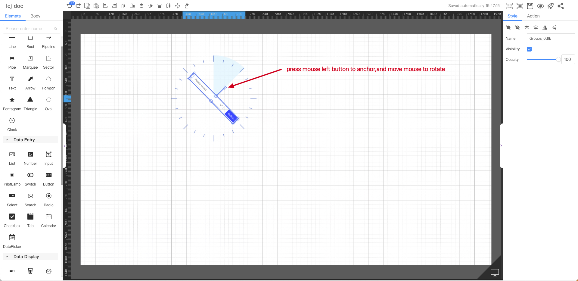
Rotating Components
The component can be rotated
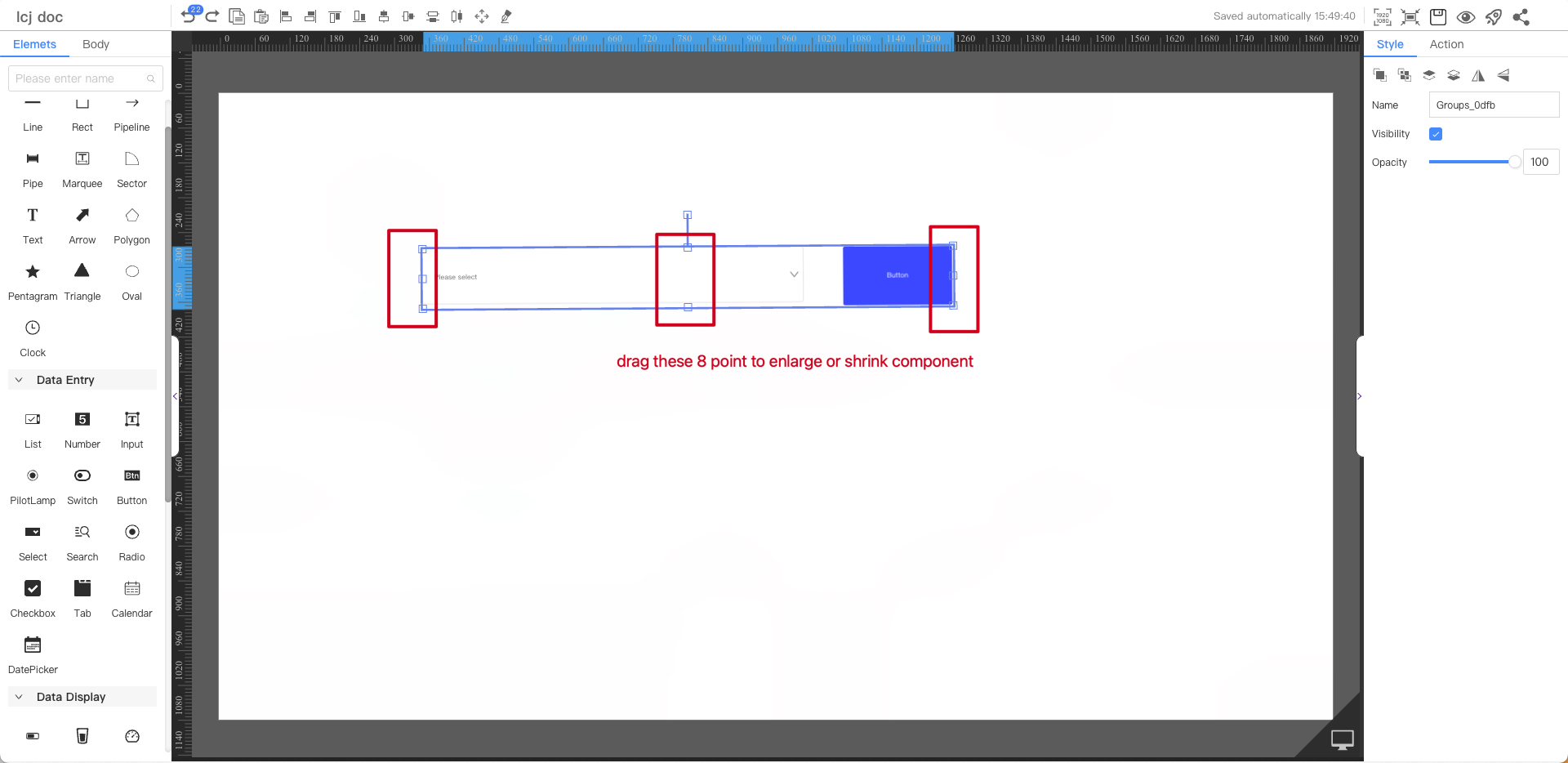
Zoom In and Out Components
You can zoom in and out the component
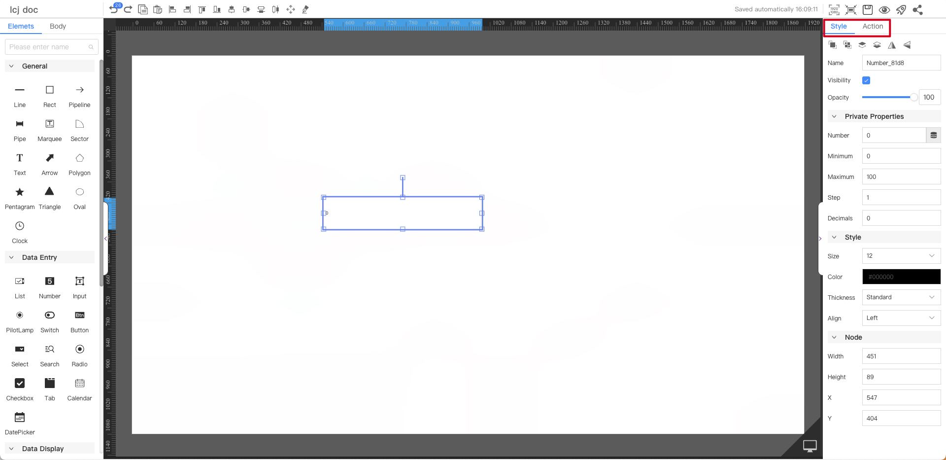
Properties Panel
Click on a blank area of the canvas, and the properties items will appear in the right sidebar
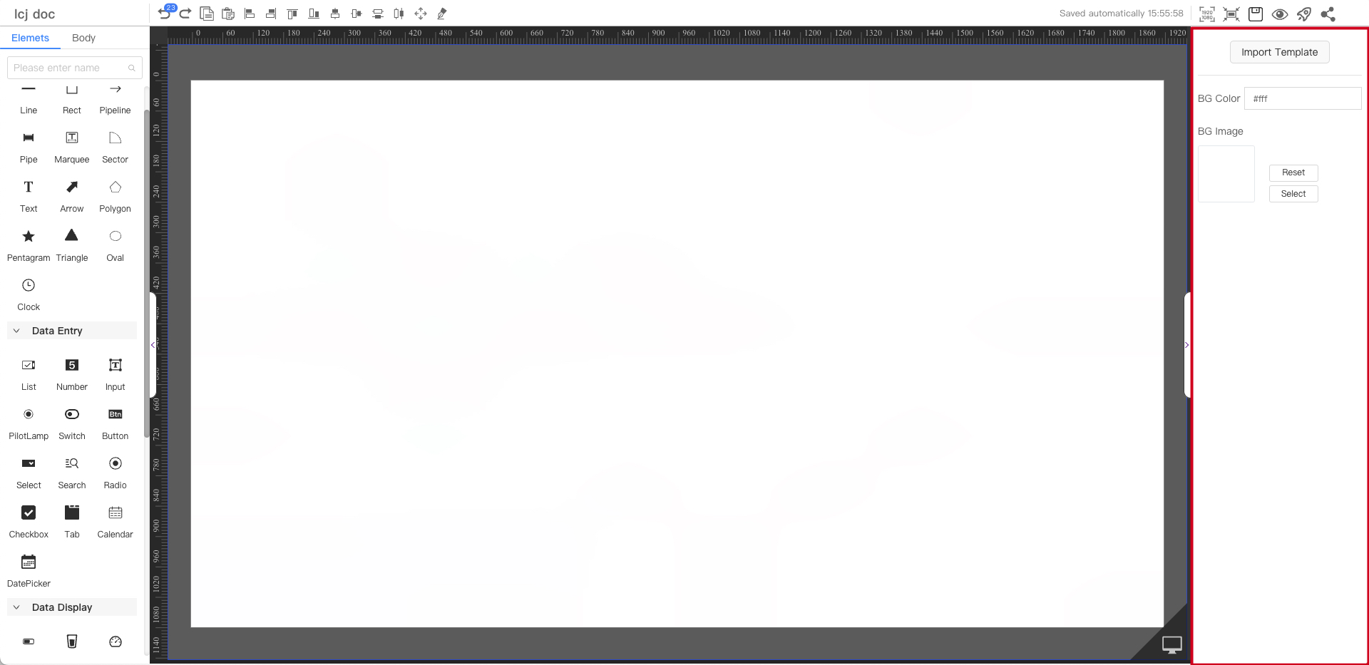
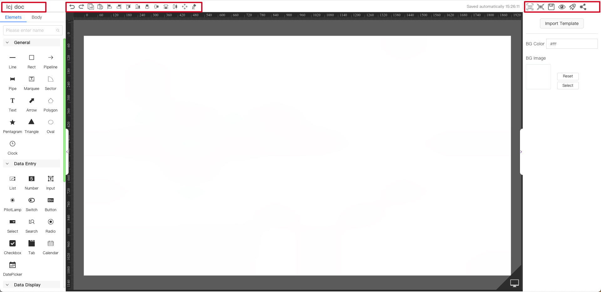
Canvas Properties
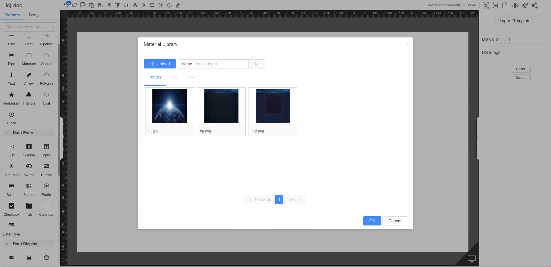
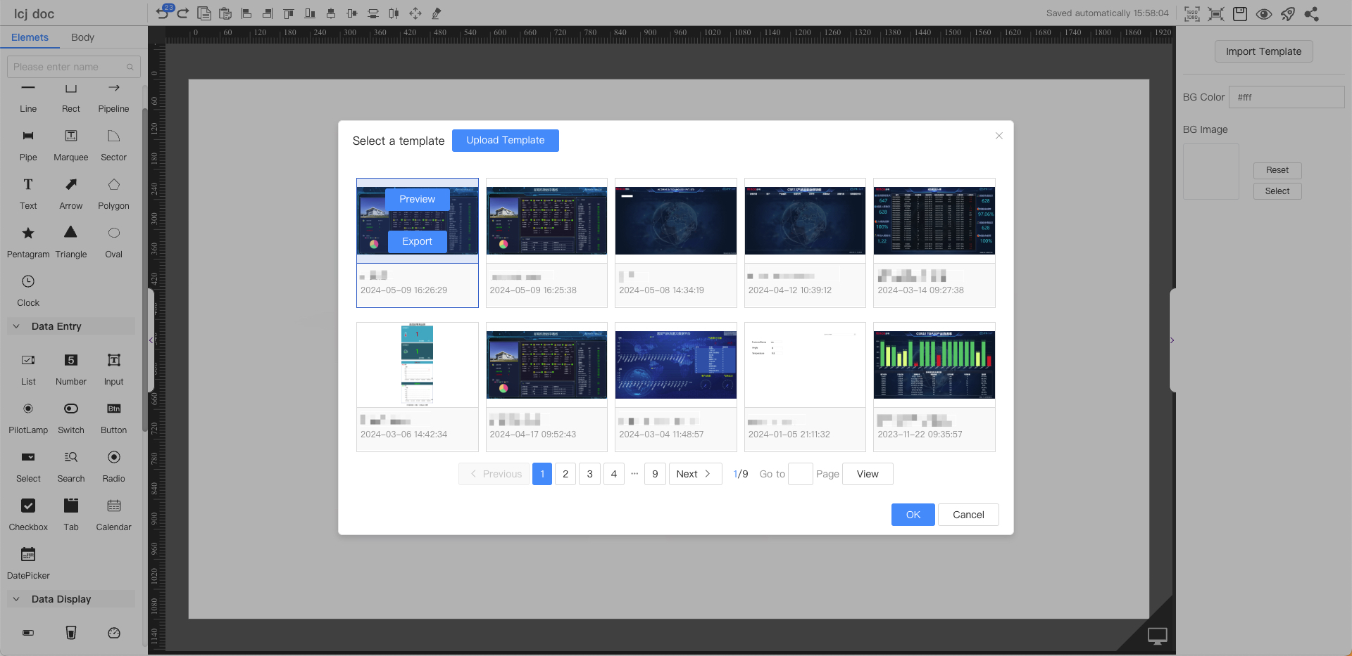
- Import template:Load the shared board
- Background color and image:Board background properties
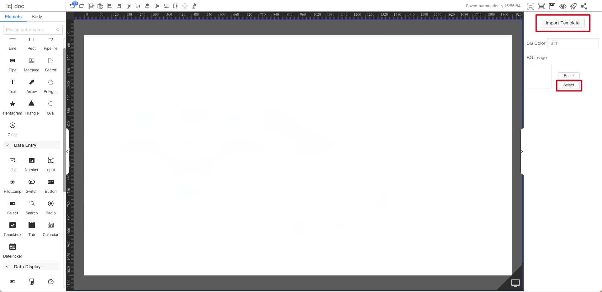
You can directly select the shared board page to import
You can select the background color of the current page