Text
The text component displays the specified content in text form.This article introduces the detailed configuration method of the text component.
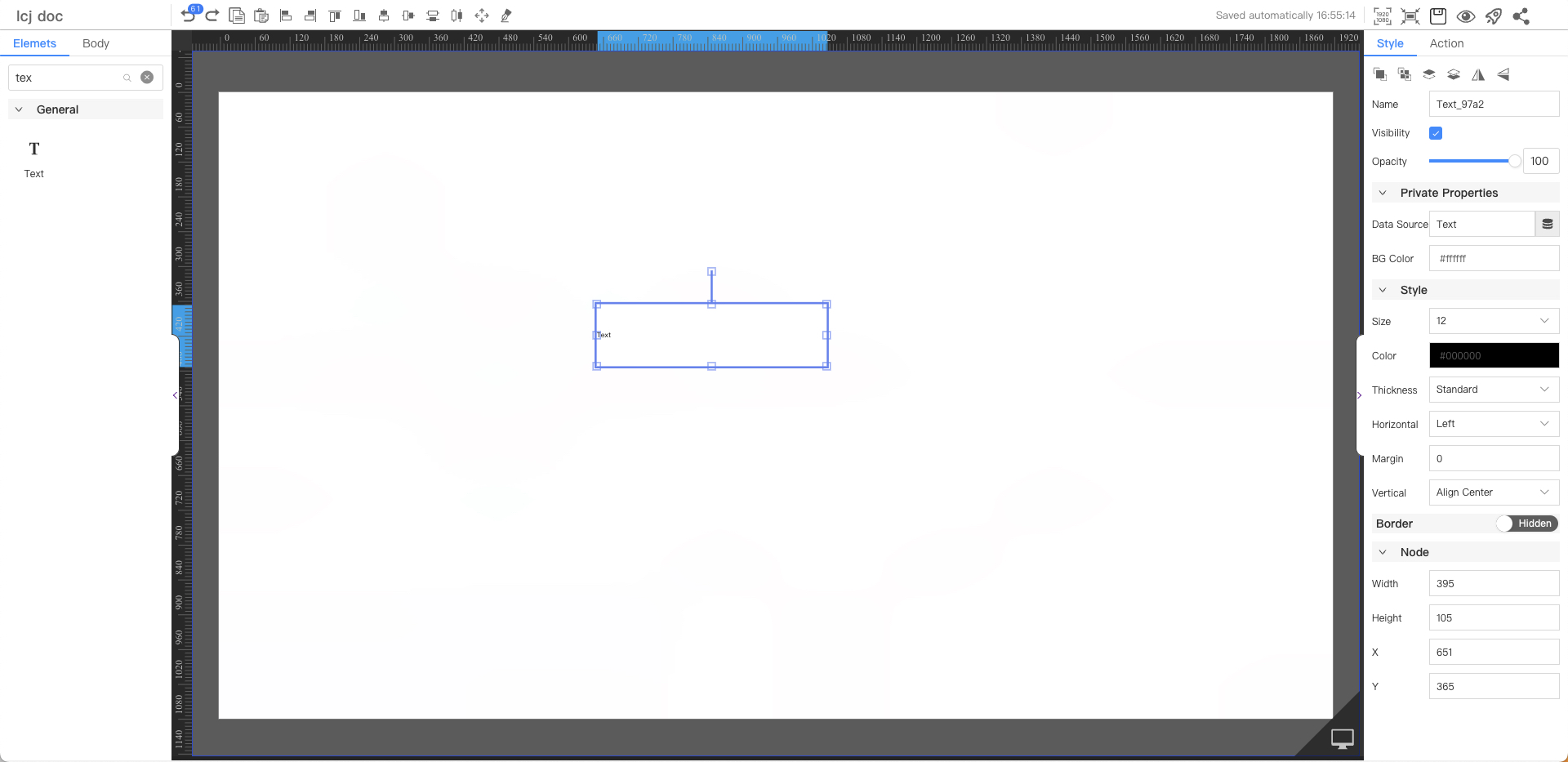
Private Properties
Parameters | Description | Default value |
|---|---|---|
| Data Source | Configurable data sources | Text |
| BG Color | #ffffff |
Text Style
Parameters | Description | Default value |
|---|---|---|
| Size | Optional value: 12~72 | 12 |
| Color | #000000 | |
| Thickness | Optional values: Standard, Bold | Standard |
| Horiz Align | Optional values: Left, Center, Right | Left |
| Margin | Horizontal alignment margins, not displayed when centered | 0 |
| Vert Align | Optional values: Top, Center, Bottom | Center |
Node
Parameters | Description | Default value |
|---|---|---|
| Width | Overall width | 152 |
| Height | Overall height | 40 |
| X | Horizontal coordinate | — |
| Y | Vertical coordinate | — |
Application Examples
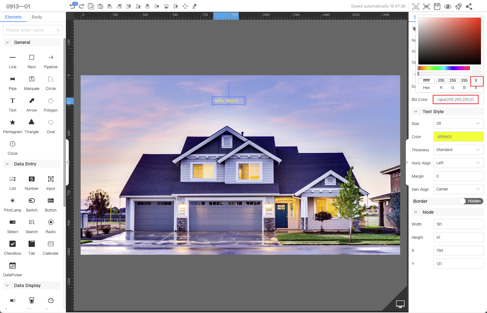
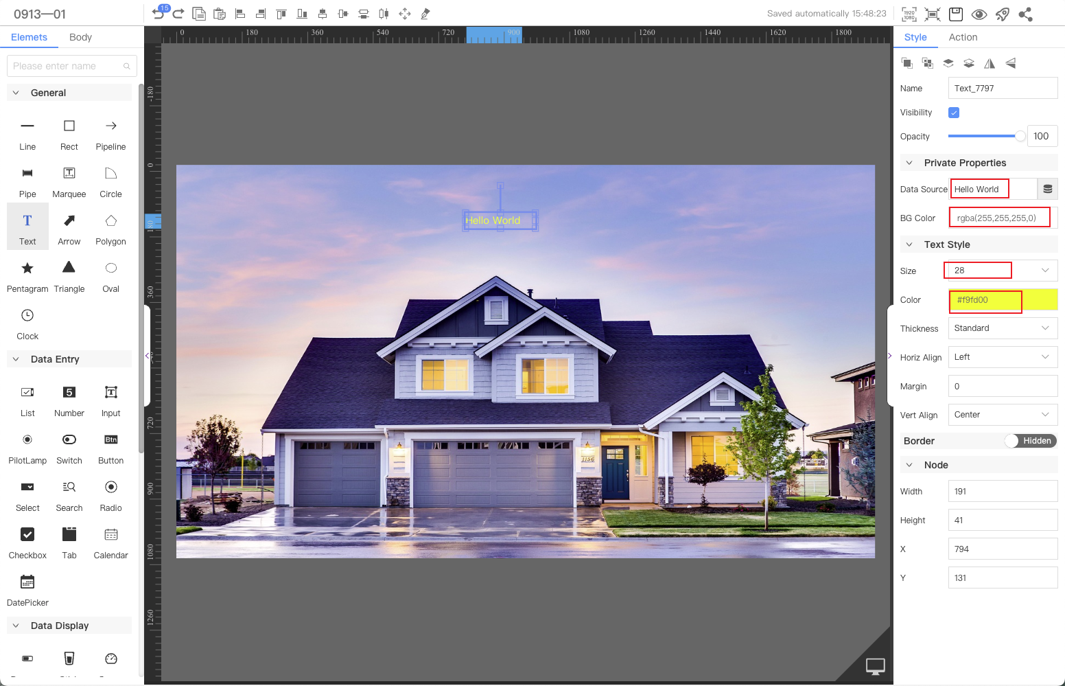
When developing Web visualization applications, use the Text component to set the page title.
FAQ
1. How to set the background of the text component dragged onto the canvas to be transparent?
Normally, we only need to set the font color for the text component without setting the background color, so the background transparency can be adjusted to 0.