Progress
The progress component displays the current progress of an operation or the percentage of the current capacity of a device in a linear form.This article introduces the detailed configuration method of the progress component.
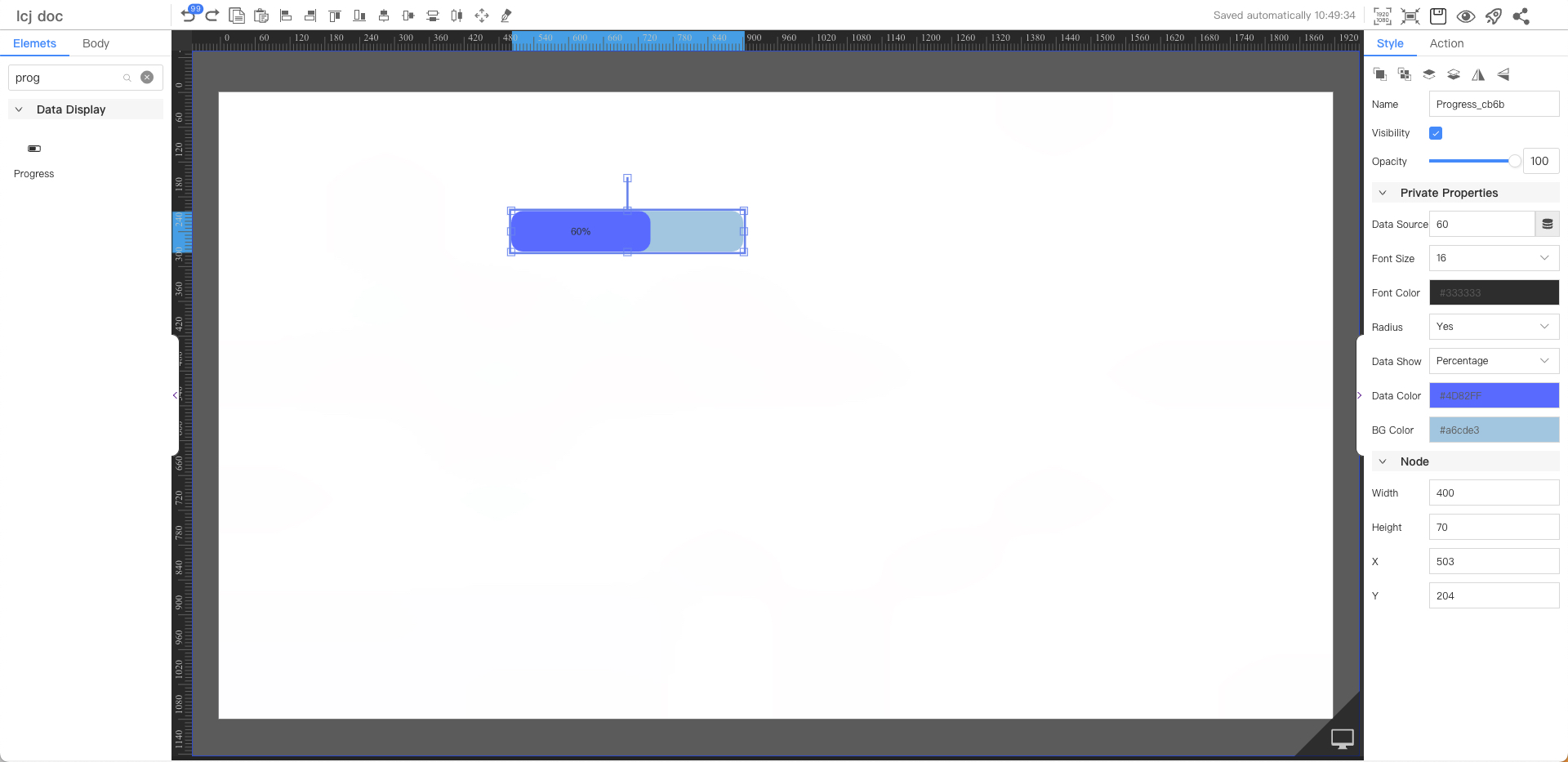
Private Properties
Parameters | Description | Default value |
|---|---|---|
| Data Source | Configurable data sources | 60 |
| Font Size | Optional value: 12~72 | 16 |
| Font Color | #333333 | |
| Radius | Optional values: Yes, No | Yes |
| Data Show | Optional values: Value, Percentage, Hide | Percentage |
| Fill Color | #4d82ff | |
| BG Color | #a6cde3 |
Node
Parameters | Description | Default value |
|---|---|---|
| Width | Overall width | 200 |
| Height | Overall height | 33 |
| X | Horizontal coordinate | — |
| Y | Vertical coordinate | — |
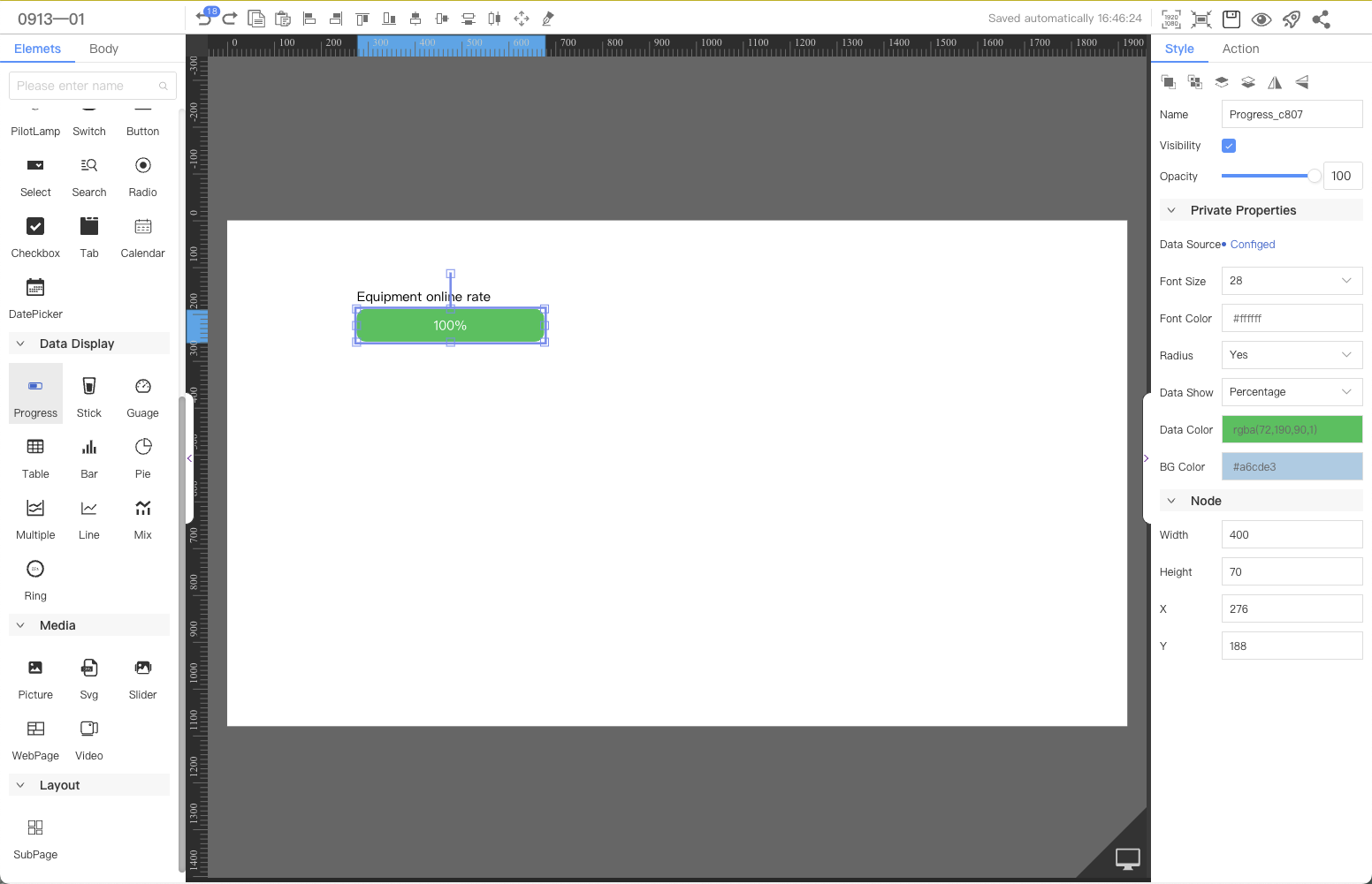
Application Examples
The online rate or offline number of the current device is intuitively displayed with a progress bar.
FAQ
1. Which data source is referenced in this case?
Please refer to System Data Source->Device Online Rate and Number of Offline Devices.
2. How does a component configure a data source?
Please refer to (Component Configuration Data Source)