Pie
The pie component displays the proportion of different classification data in a pie shape or ring shape.This article introduces the detailed configuration method of the pie component.
Private Properties
Parameters | Description | Default value |
|---|---|---|
| Data Source | Configurable data sources | |
| Dimension | ||
| Measures | ||
| Color tag | Configurable | |
| Hollow | Optional values: Yes, No | No |
Color
Pie color configuration
Parameters | Description | Default value |
|---|---|---|
| Color List | The color palette of the pie chart can be added, modified, and deleted. | Default:#63b2ee, #76da91, #f8cb7f |
Title
Not displayed by default
Parameters | Description | Default value |
|---|---|---|
| Text | Pie Chart | |
| Size | Optional value: 12~72 | 16 |
| Color | #333333 | |
| Thickness | Optional values: Standard, Bold | Standard |
| Postion | Optional values: Right, Center, Left | Left |
| BG Color | #ffffff |
Legend
Parameters | Description | Default value |
|---|---|---|
| Size | Optional value: 12~72 | 12 |
| Color | #333333 | |
| Thickness | Optional values: Standard, Bold | Standard |
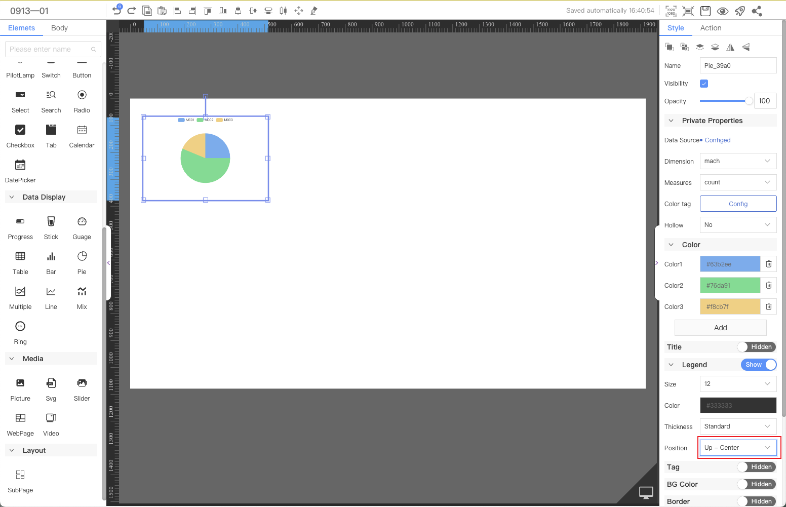
| Position | Optional values: Up-Left, Up-Center, Up-Right, Left-Up, Left-Middle, Left-Bottom, Right-Top, Right-Middle, Right-Bottom, Bottom-Left, Bottom-Center, Bottom-Right | Up-Left |
Tag
Not displayed by default, pie displays details
Parameters | Description | Default value |
|---|---|---|
| Position | Optional values: Outside, Inner | Outside |
| Show | Optional values: Tag + Value, Tag, Value | Tag + Value |
| Label Size | Optional value: 12~72 | 12 |
| Tag Color | #333333 | |
| Thickness | Optional values: Standard, Bold | Standard |
| Tag Suffix | Fixed text displayed after the value | |
| Data Size | Optional value: 12~72 | 12 |
| Value Color | #333333 | |
| Thickness | Optional values: Standard, Bold | Standard |
| Value Suffix | Fixed text displayed after the value |
BG Color
Not displayed by default
Parameters | Description | Default value |
|---|---|---|
| Color | #ffffff |
Border
Not displayed by default
Parameters | Description | Default value |
|---|---|---|
| Thickness | 1 | |
| Color | #999999 | |
| Line Style | Optional values: solid line, dashed line, dotted line | straight line |
Node
Parameters | Description | Default value |
|---|---|---|
| Width | Overall width | 300 |
| Height | Overall height | 200 |
| X | Horizontal coordinate | — |
| Y | Vertical coordinate | — |
Application Examples
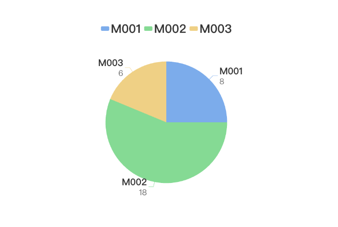
The pie chart component is used to count and display the usage percentage of each model of equipment in a factory.
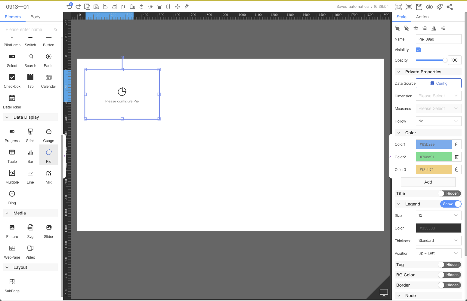
Step 1: Add components
Above the component list on the left side of the canvas, enter pie chart, find the component, and then drag the component to the middle canvas.
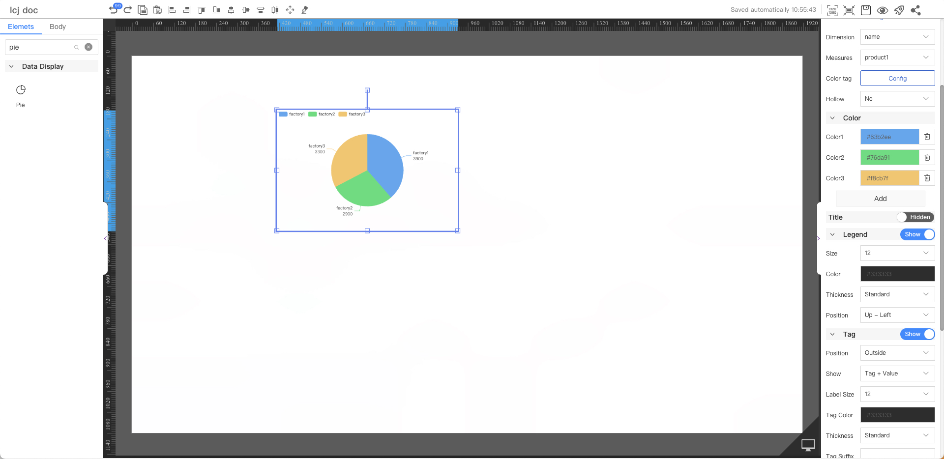
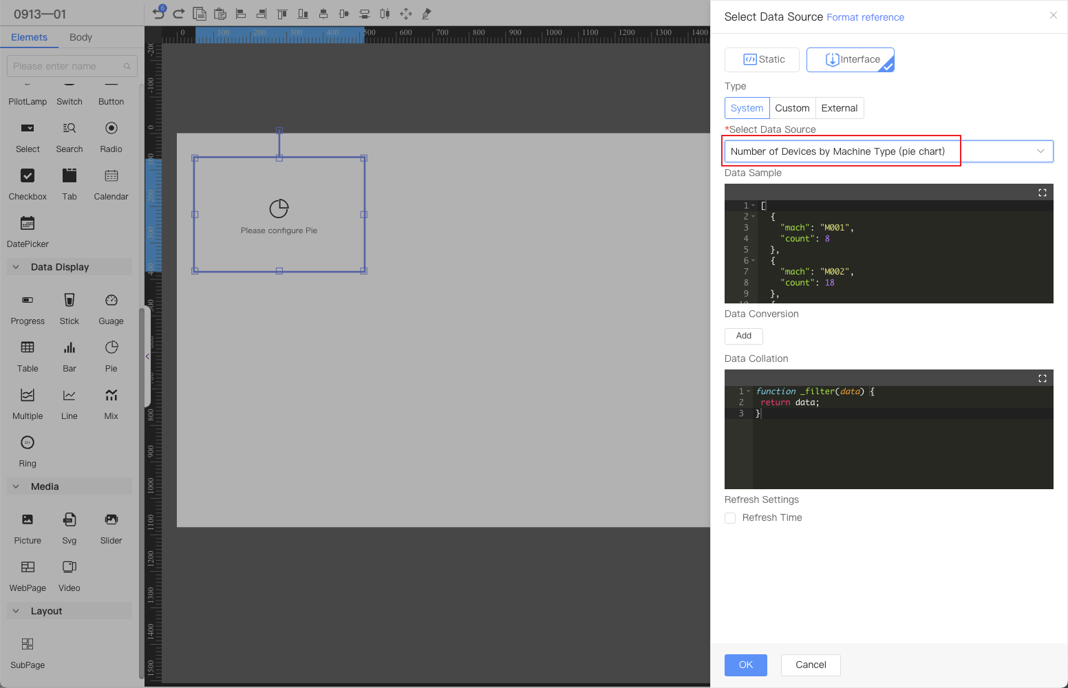
Step 2: Configure the data source
In the Web editor, select the component and click Configure Data Source in the style on the right.
Note:The current demonstration uses the system data source by default. In actual applications, it can be replaced with a custom data source according to user needs.
Step 3: Configure the style
Configure the results returned by the interface as the dimension and measurement data of the chart.
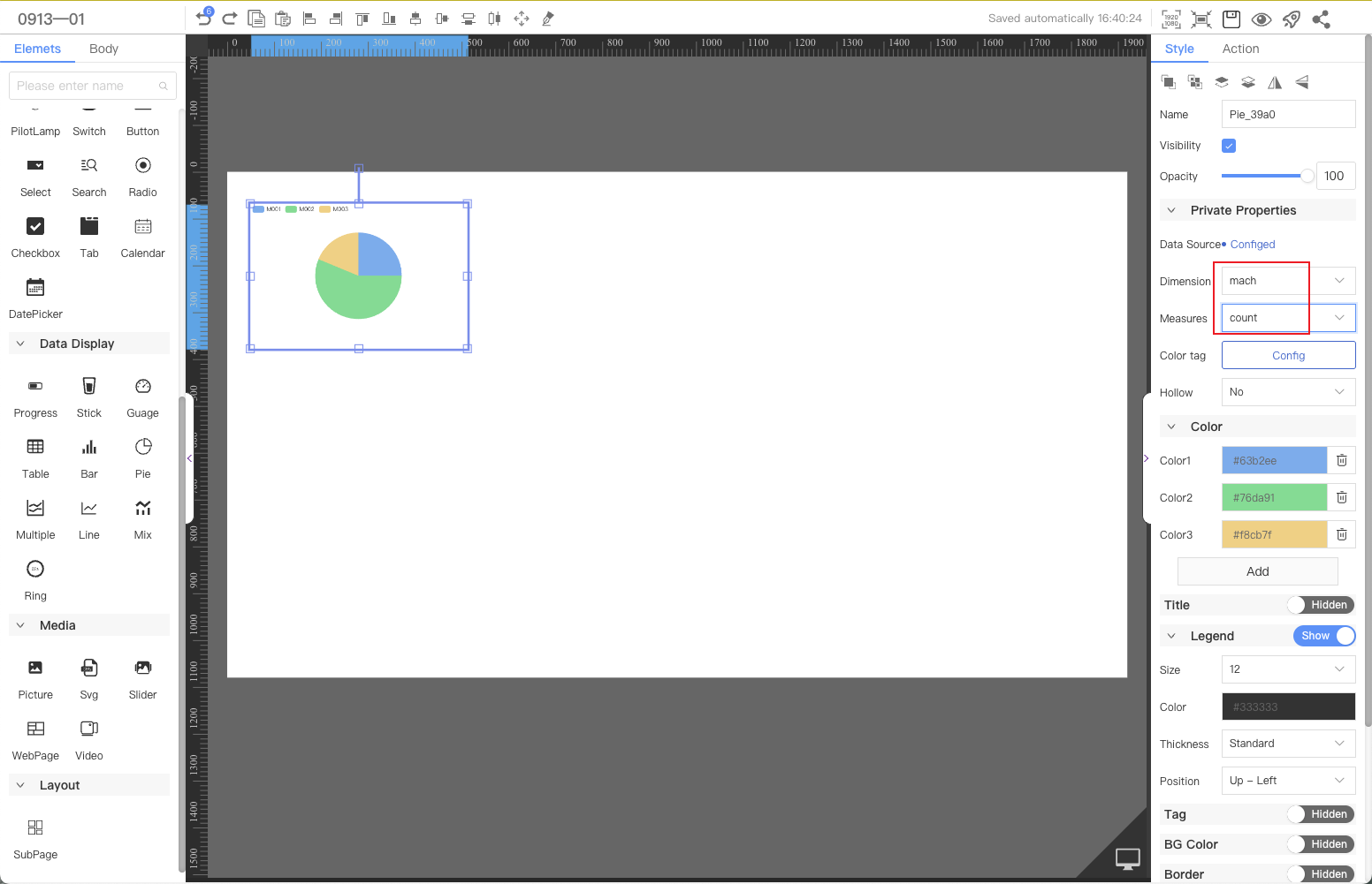
Finally, adjust the position of the legend to be centered