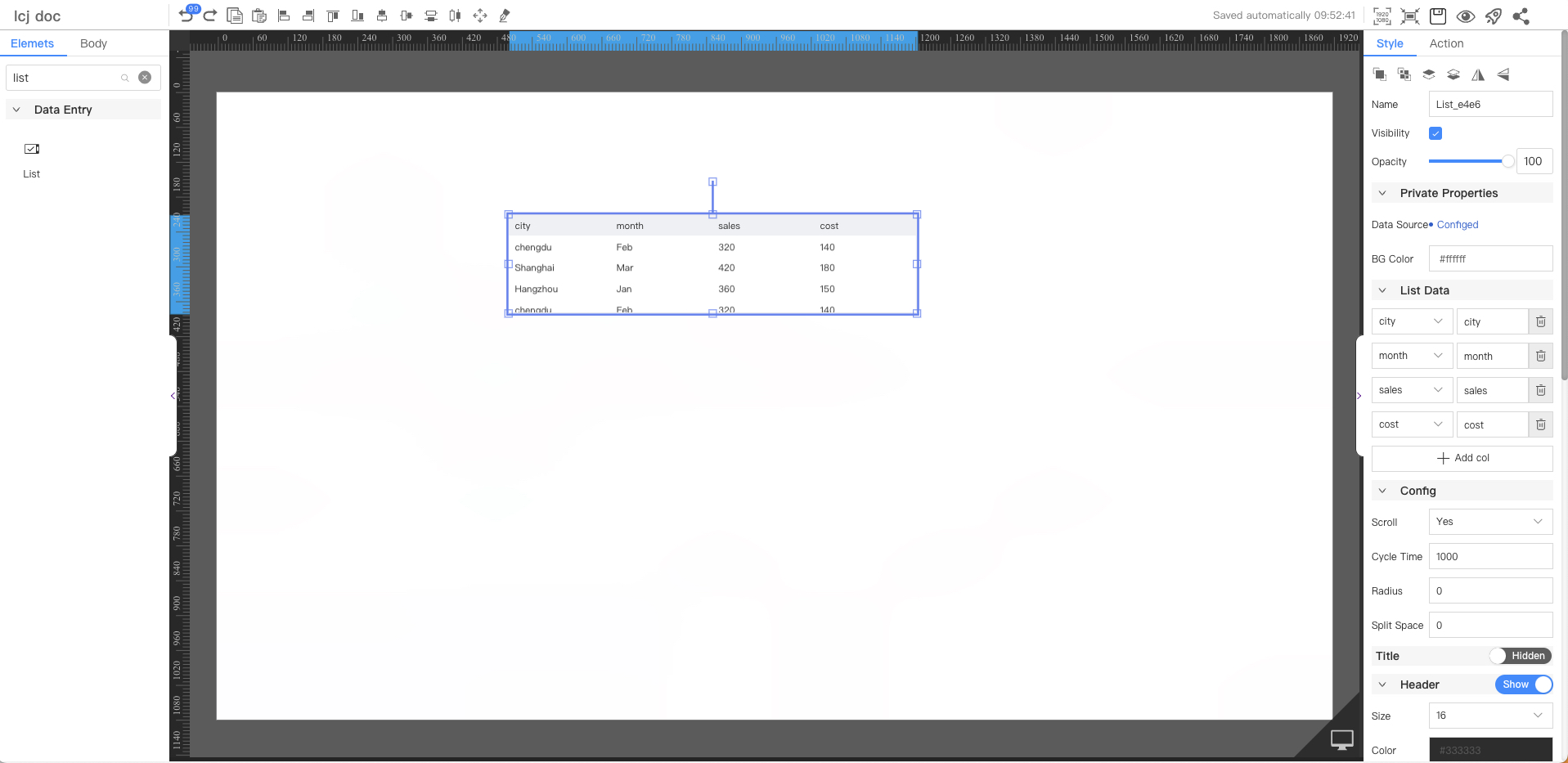
List
The scroll list component is suitable for scenarios with large amounts of data, limited space, or that require dynamic loading, such as displaying temperature data of IoT devices.This article describes the detailed configuration method of the component.
Private Properties
Parameters | Description | Default value |
|---|---|---|
| Data Source | Configurable data sources | — |
| BG Color | #ffffff |
List Data
After the data source is configured, the column name of the acquired data is displayed. The display name can be customized
Parameters | Description | Default value |
|---|---|---|
| The column name of the data | Data Key | — |
Config
Parameters | Description | Default value |
|---|---|---|
| Scroll | Optional values: Yes, No | Yes |
| Cycle Time | 1000 | |
| Radius | 0 | |
| Split Space | 0 |
Title
Not displayed by default
Parameters | Description | Default value |
|---|---|---|
| Text | ||
| Size | Optional value: 12~72 | 16 |
| Color | #333333 | |
| Thickness | Optional values: Standard, Bold | Standard |
| Position | Optional values: Right, Center, Left | Left |
| BG Color | #ffffff |
Header
Default Display
Parameters | Description | Default value |
|---|---|---|
| Size | Optional value: 12~72 | 16 |
| Color | #333333 | |
| Thickness | Optional values: Standard, Bold | Standard |
| Position | Optional values: Right, Center, Left | Left |
| BG Color | #f0f2f5 | |
| Height | 36 |
Content
Parameters | Description | Default value |
|---|---|---|
| Title content | ||
| Size | Optional value: 12~72 | 16 |
| Color | #333333 | |
| Thickness | Optional values: Standard, Bold | Standard |
| Position | Optional values: Right, Center, Left | Left |
| BG Color | #ffffff | |
| Height | 36 |
Inside Border
Not displayed by default
Parameters | Description | Default value |
|---|---|---|
| Thickness | 1 | |
| Color | #dcdfe6 | |
| Line Style | Optional values: straight line, dashed line, dotted line | straight line |
Outside Borders
Default Display
Parameters | Description | Default value |
|---|---|---|
| Thickness | 1 | |
| Color | #dcdfe6 | |
| Line Style | Optional values: straight line, dashed line, dotted line | straight line |
Export
Not displayed by default
Parameters | Description | Default value |
|---|---|---|
| Align | Optional values: Right, Center, Left | Right |
| Name | Export | |
| Size | Optional value: 12~72 | 12 |
| Color | #ffffff | |
| Thickness | Optional values: Standard, Bold | Standard |
Border
Default Display
Parameters | Description | Default value |
|---|---|---|
| Thickness | 1 | |
| Fill Color | #ffffff | |
| Style | Optional values: straight line, dashed line, dotted line | straight line |
Aggregate
Not displayed by default
Parameters | Description | Default value |
|---|---|---|
Aggregate functions | You can customize multiple filter conditions to aggregate dataStatistical method:Sum, Average, Count |
Node
Parameters | Description | Default value |
|---|---|---|
| Width | Overall width | 300 |
| Height | Overall height | 200 |
| X | Horizontal coordinate | — |
| Y | Vertical coordinate | — |
Application Examples
Displays the temperature data reported by a sensor device every day in the past 7 days in a scrolling list.

FAQ
1. Which data source is referenced in this case?
Please refer to (Statistics of the average temperature, maximum temperature, and minimum temperature of each day in the past 7 days)
2. How does a component configure a data source?
Please refer to (Component Configuration Data Source)
3. How to set the background of the list dragged onto the canvas to be transparent?
Please set the background transparency of the following parts to 0 and the color to ffffff:
- Private properties
- Header
- content
For specific operation methods, please refer to:

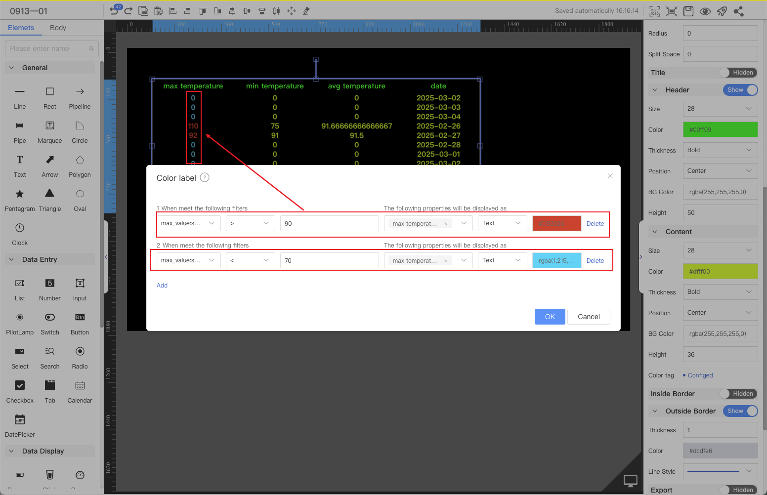
4. How to set different colors for the data in the list to distinguish the display according to specific conditions?
The following are configuration examples of text color and cell background for reference.