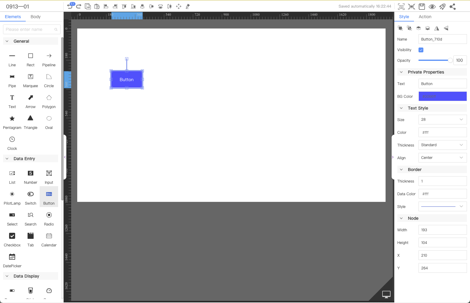
Button
The button component can be used to implement interactive functions, such as opening a link, changing component visibility, calling a service, and assigning values to page variables.This article introduces the detailed configuration method of the component
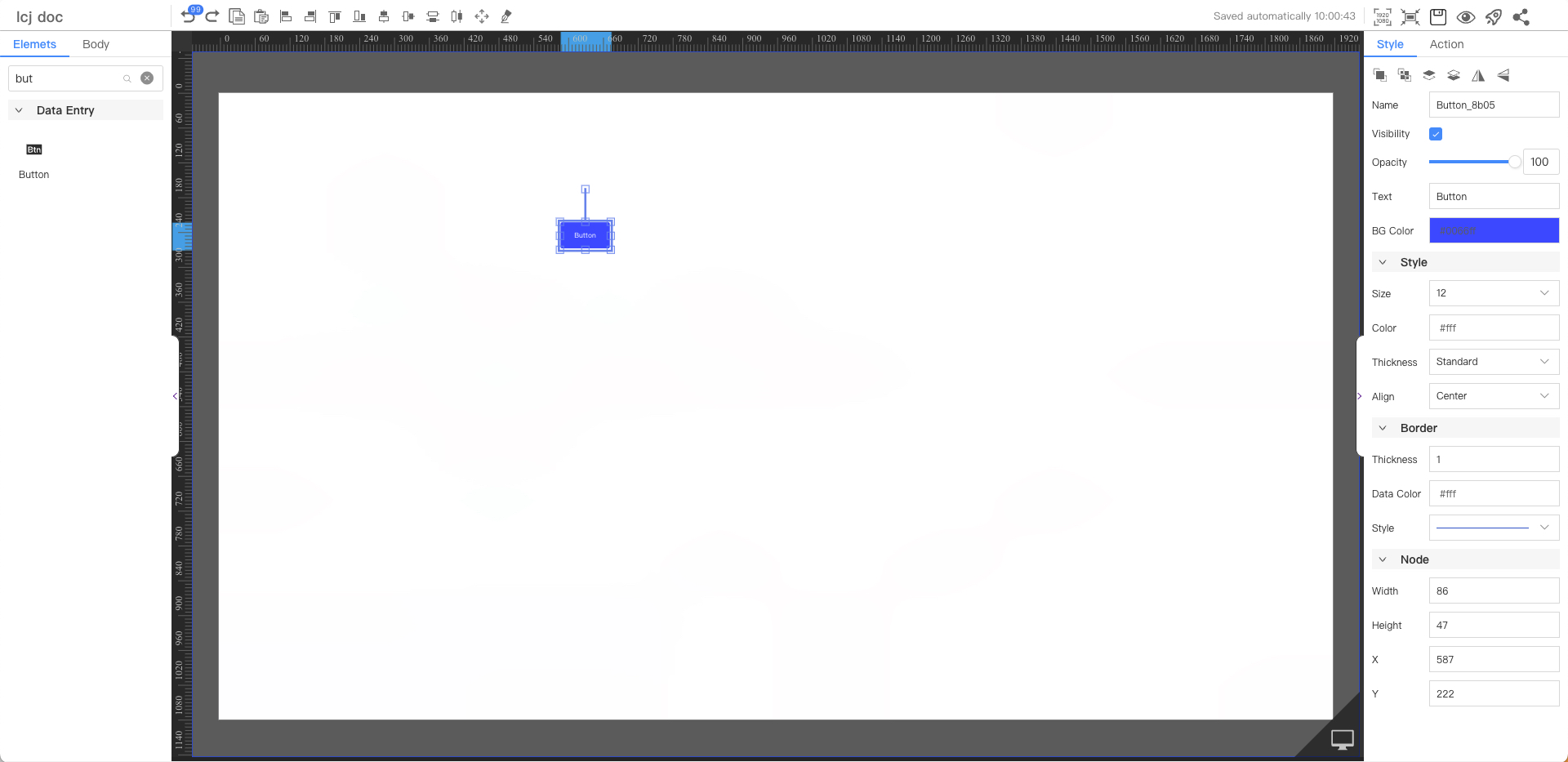
Text Style
Parameters | Description | Default value |
|---|---|---|
| Text | Button | |
| BG Color | #0066ff | |
| Size | Optional value: 12~72 | 12 |
| Color | #ffffff | |
| Thickness | Optional values: Standard, Bold | Standard |
| Align | Optional values: Left, Center, Right | Center |
Border
Parameters | Description | Default value |
|---|---|---|
| Thickness | 1 | |
| Fill Color | #ffffff | |
| Style | Optional values: straight line, dashed line, dotted line | straight line |
Node
Parameters | Description | Default value |
|---|---|---|
| Width | Overall width | 60 |
| Height | Overall height | 32 |
| X | Horizontal coordinate | — |
| Y | Vertical coordinate | — |
Application Examples
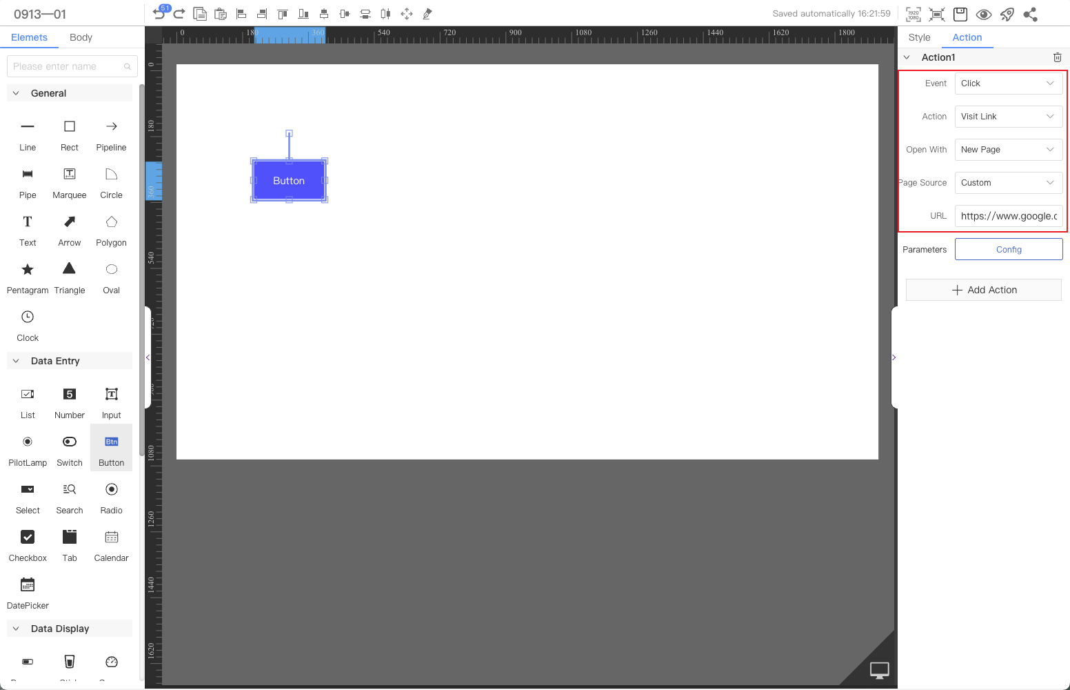
The button component opens the specified web link.
Step 1: Add components
Above the component list on the left side of the canvas, enter "button", find the component, and then drag the component to the middle canvas.
Step 2: Configure interactive actions
Select the component's Interaction tab and configure events and interaction actions.For specific operations, please refer to the Interaction configuration.