Input
Compared with the text component, the Input component adds text input capabilities, for example, it can be used as a search box on the page.The detailed configuration of this component is described below.
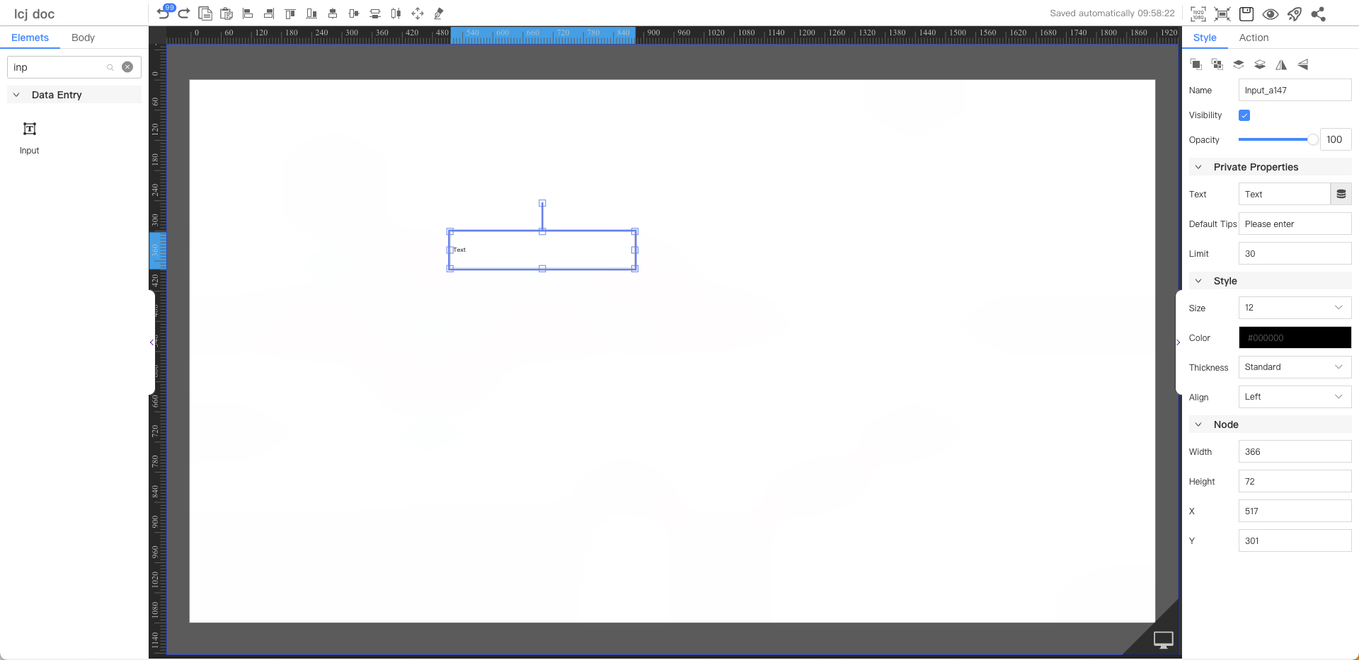
Private Properties
Parameters | Description | Default value |
|---|---|---|
| Text | Configurable data sources | Text |
| Default Tips | The text to display when no text is entered | Please enter |
| Limit | Maximum number of characters that can be entered | 30 |
Text Style
Parameters | Description | Default value |
|---|---|---|
| Size | Optional value: 12~72 | 12 |
| Color | #000000 | |
| Thickness | Optional values: Standard, Bold | Standard |
| Align | Optional values: Left, Center, Right | Left |
Node
Parameters | Description | Default value |
|---|---|---|
| Width | Overall width | 180 |
| Height | Overall height | 35 |
| X | Horizontal coordinate | — |
| Y | Vertical coordinate | — |