Tab
This component provides the ability to switch content between tabs. It needs to complete the component capabilities through interactive events, hiding and showing.
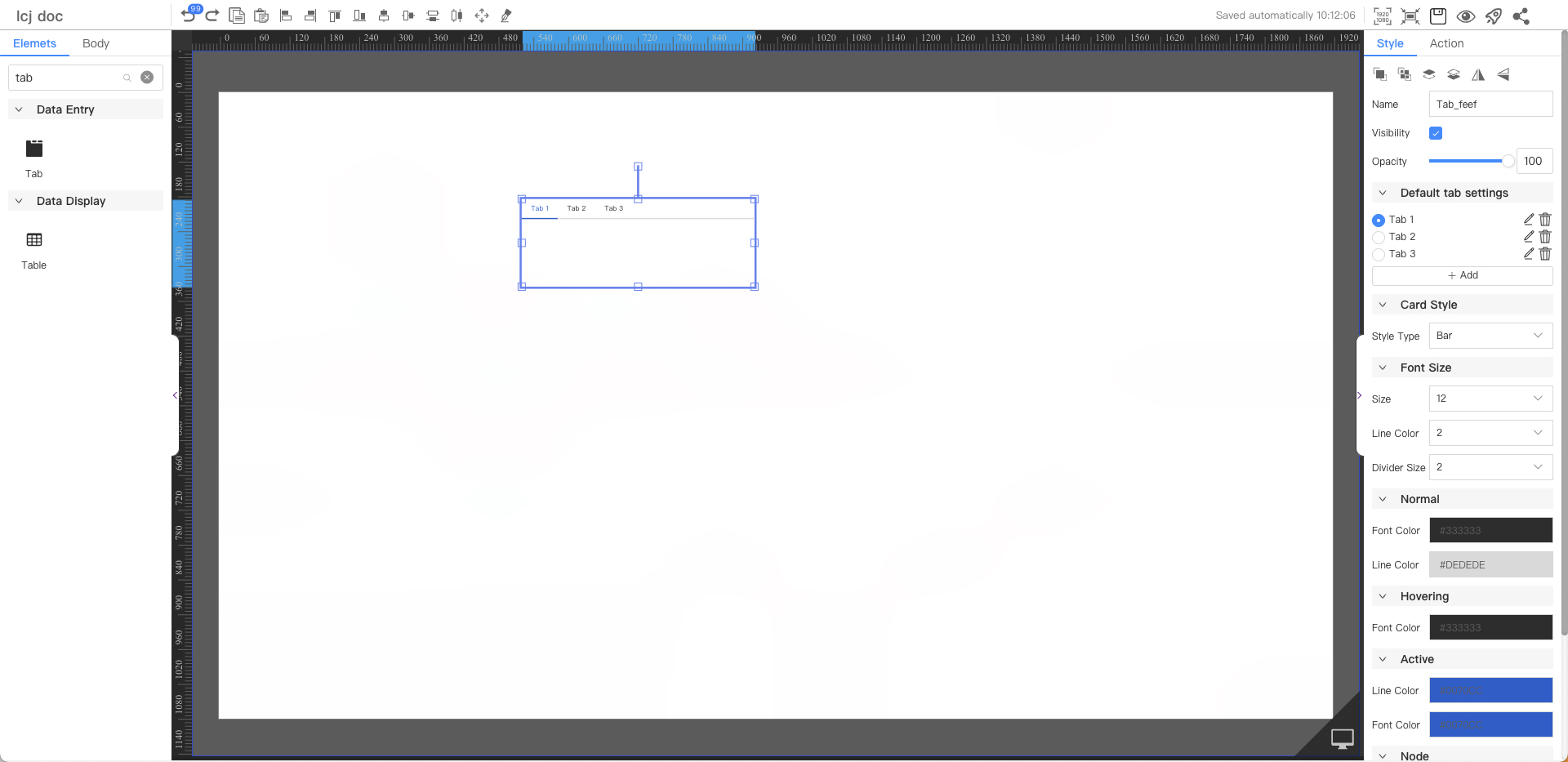
Default tab settings
Parameters | Description | Default value |
|---|---|---|
| name | Customize tab name | Tab 1 |
Card Style
Parameters | Description | Default value |
|---|---|---|
| Style Type | Optional values: Bar, Capsule, Open, Pack | Bar |
Font Size
Parameters | Description | Default value |
|---|---|---|
| Size | Optional value: 12~72 | 12 |
| Line Color | Select the width of the tab. Optional values: 1, 2, 3. | 2 |
| Divider Size | The width of the line between the tab and the content. Optional values: 1, 2, 3. | 2 |
Normal
Parameters | Description | Default value |
|---|---|---|
| Font Color | Text Color | #333333 |
| Line Color | Color of dividing line | #DEDEDE |
Hover
Parameters | Description | Default value |
|---|---|---|
| Font Color | Hover text color when moving in | #333333 |
Active
Parameters | Description | Default value |
|---|---|---|
| Line Color | The color of the selected tab | #0070cc |
| Font Color | Selected Tab text color | #0070cc |
Node
Parameters | Description | Default value |
|---|---|---|
| Width | Overall width | 400 |
| Height | Overall height | 150 |
| X | Horizontal coordinate | — |
| Y | Vertical coordinate | — |