Checkbox
This component is used to perform multiple selection operations among a set of alternatives.The following describes how to configure the components in detail.
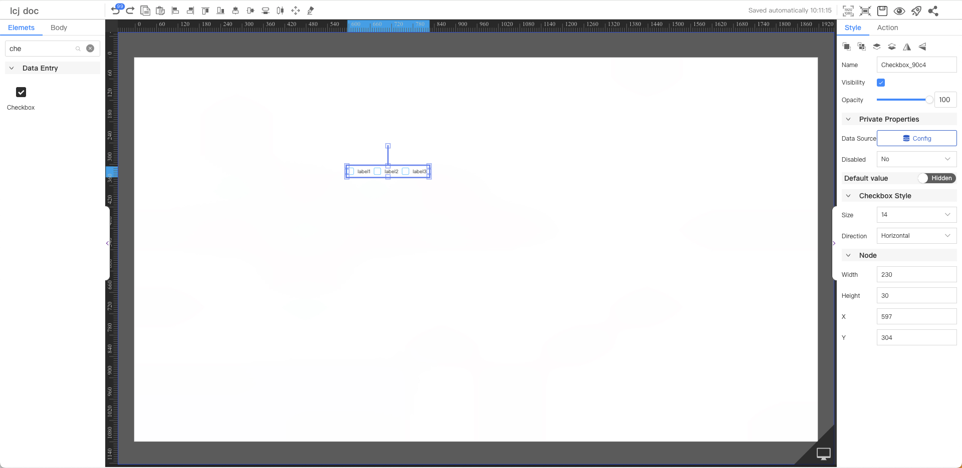
Private Properties
Parameters | Description | Default value |
|---|---|---|
| Data Source | Configurable data sources | |
| Disabled | You cannot use optional value: Yes, No | No |
Default Value
Not displayed by default
Parameters | Description | Default value |
|---|---|---|
| Selected | Optional from the value obtained | The first item in the list |
Checkbox Style
Parameters | Description | Default value |
|---|---|---|
| Size | Optional value: 12~72 | 14 |
| Direction | Optional values: Horiz, Vert | Horiz |
Node
Parameters | Description | Default value |
|---|---|---|
| Width | Overall width | 230 |
| Height | Overall height | 30 |
| X | Horizontal coordinate | — |
| Y | Vertical coordinate | — |