Select
The Select component can contain multiple elements and supports selection after clicking.The following describes how to configure the components in detail.
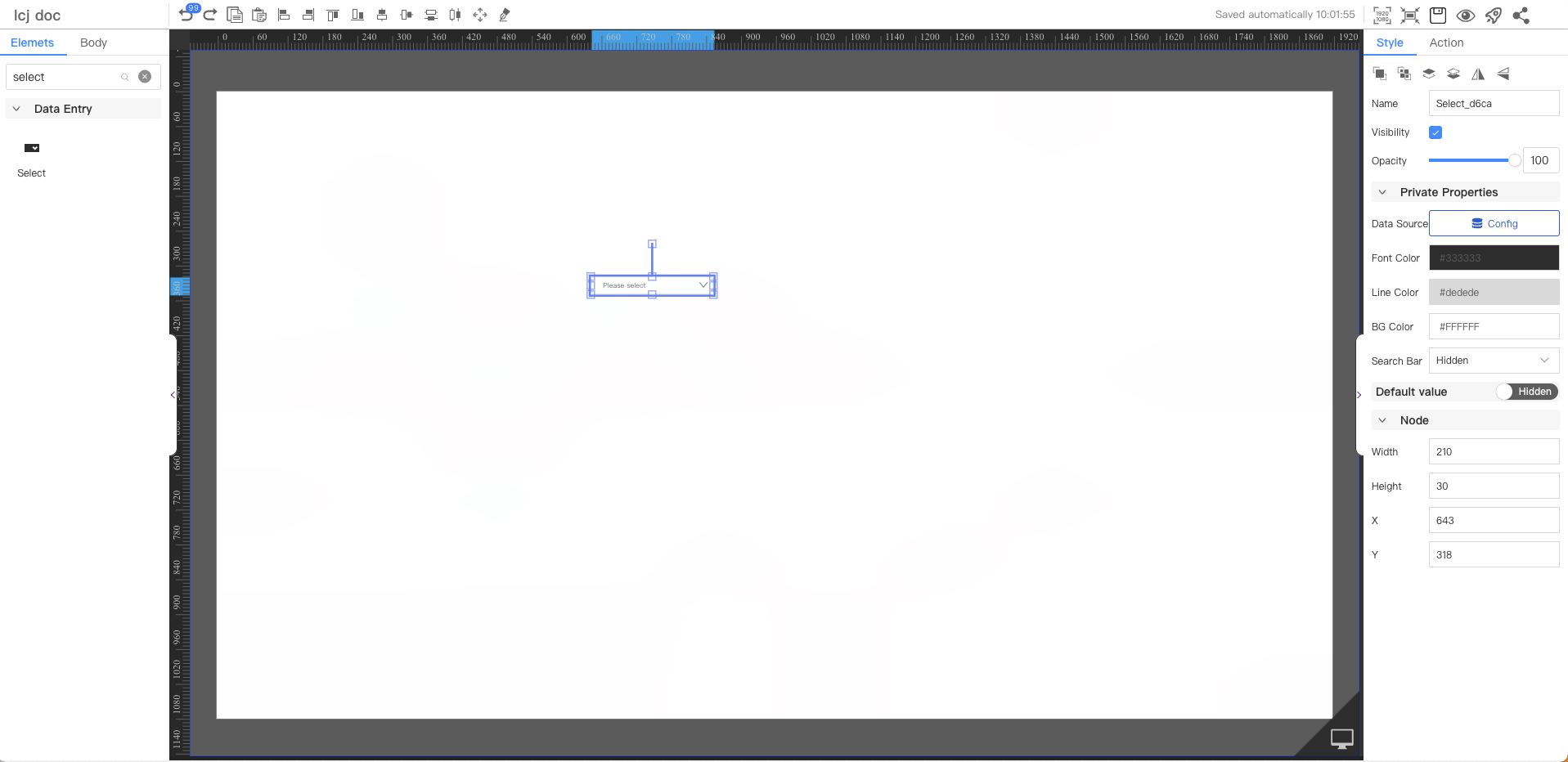
Private Properties
Parameters | Description | Default value |
|---|---|---|
| Data Source | Configurable data sources | |
| Font Color | #333333 | |
| Line Color | #dedede | |
| BG Color | #ffffff | |
| Search Bar | Optional values: Show, Hide | Hide |
Default Value
Not displayed by default
Parameters | Description | Default value |
|---|---|---|
| Method | By default, the first item in the list is displayed | The first item in the list |
Node
Parameters | Description | Default value |
|---|---|---|
| Width | Overall width | 210 |
| Height | Overall height | 30 |
| X | Horizontal coordinate | — |
| Y | Vertical coordinate | — |