Ring
The ring progress bar component uses a circle to display the current progress of an operation or the percentage of the current capacity of a device.This article introduces the detailed configuration method of the ring component.
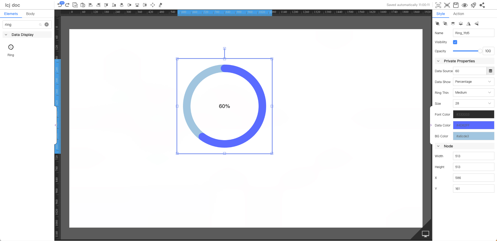
Private Properties
Parameters | Description | Default value |
|---|---|---|
| Data Source | Configurable data sources | 60 |
| Data Show | Optional values: Value, Percentage, Hide | Percentage |
| Ring Thin | Optional values: Thin, Medium, Thick | Thin |
| Size | Optional value: 12~72 | 16 |
| Font Color | #333333 | |
| Data Color | #4d82ff | |
| BG Color | #a6cde3 |
Node
Parameters | Description | Default value |
|---|---|---|
| Width | Overall width | 200 |
| Height | Overall height | 200 |
| X | Horizontal coordinate | — |
| Y | Vertical coordinate | — |